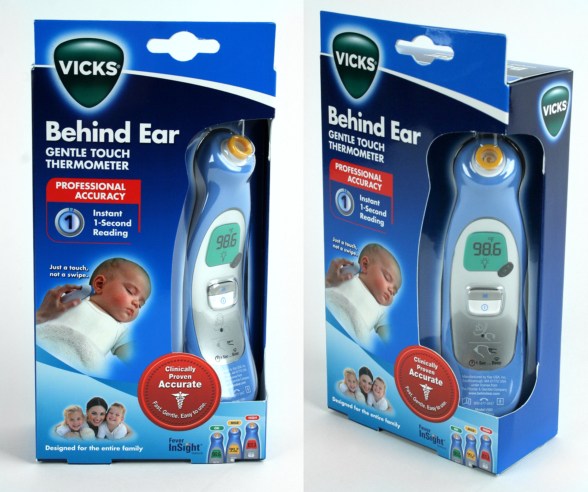
After the initial launch we were required to reduce the packaging for sustainability reasons. The package size was reduced by 40%. I designed the corner window package to show as much of the product as possible. To increase the visual impact on shelf, I layered two Pantone Spot blue inks creating a strong contrast of rich blue to pop on shelf.

This Braun Blood pressure package was developed in partnership with a packaging company and in-house packaging engineer. The product was the first Bluetooth Blood Pressure monitor for the Braun brand. The package was designed to be a premium unboxing experience for the consumer. Rigid package structure design with magnetic enclosures were used for a premium feel. The product imagery was all created with 3D renderings from original CAD files to ensure fine detail and give a premium look. The product was launched in the European marketplace. I Art Directed our European Senior Designer to complete this project.
I designed the Braun wrist blood pressure package by working closely with our China office and the product vendor. Marketing wanted to update the package design to better present the product. This was an existing product and they wanted to update from a closed package to a window package while we were updating the branding.
The Braun ear thermometer was the only product technology for the brand for many years. When we launched a forehead swipe and a no-touch thermometer the strategy was to created different package forms for each product to help the consumer differentiate one technology from the other. I worked with vendors in the US and AP to create package die lines that worked with the product form. I directed the design team in executing the brand look for each new product. New photography was required and I art directed the photo shoots to create infuse photos.